PROJECT 04
From Generic to Growth

The challenge
Underperforming B2B landing pages and generic messaging have led to a decline in lead-generation conversions and overall B2B revenue. The current experience fails to communicate the specific benefits of a corporate subscription, leaving prospects unclear on the value for their employees. We need to elevate user intent by introducing industry-led value propositions that simplify the decision-making process, and drive higher engagement with our primary 'Contact' and 'Schedule' CTAs. Our goal is to:
-
Increase numbers of prospects submitting a "Contact us" form by 30%
-
Increase numbers of prospects scheduling a call via "Calendly" integration by 30%
-
Increase numbers of prospects purchasing their group subscription via our "Self-serve" journey
MY CONTRIBUTION
Product strategy
Workshop facilitation
User research facilitation
User research analysis
Storytelling and presenting
Product design
THE TEAM
1 x Senior Product Designer
1 x Product Manager
VP of B2B
Head of B2B
Head of B2B Sales
Head of Customer Success
6 x Full stack engineers
1 x Senior Researcher
1 x Senior Content Designer
KEY HYPOTHESIS
"Using targeted B2B value propositions, we'll increase user intent and lead generation. Reducing friction in the sales funnel, improving conversions and driving B2B revenues"
The process
This project focuses on the end-to-end research, design, and development of a new B2B ecosystem. To move beyond the limitations of a single, generic landing page, I designed a multi-layered journey that directs prospects into six specialised sub-sectors: Financial Services, Professional Services, Industrial, Government, Media, and Academia. I collaborated closely with colleagues in Marketing, Research and Content in order to better understand these prospects, their needs and end users. By surfacing tailored content for these specific industries, we aimed to increase lead quality and encourage direct engagement with our sales team.
Given our declining revenues it was key for us to launch our updated journeys within the quarter. I used a streamlined design process ensuring we met out launch date without compromising on build quality. I leveraged existing data from the Research team to help inform user journeys. I also used existing components where possible which helped me make faster decisions. Collaborating with engineers was crucial in determining the most efficient build path, ensuring the designs were as easy to maintain as they were to deploy.
Existing journeys, CVPs and emotion mapping
I began by auditing the existing user journeys to identify friction points and conversion barriers. It became clear from research that generic messaging lacked authority needed to drive engagement with our primary CTAs.
To address this, I collaborated with the Research, Marketing, and Content teams to conduct subscriber interviews and develop tailored Customer Value Propositions (CVPs) for our six key sub-sectors. By mapping out the specific "Jobs to be Done," pains, and motivations for these industries, we gained a clear strategic blueprint for the layout and content. This insight allowed us to design lead-generation pages that speak directly to prospect needs, providing the necessary social proof and value to encourage sales enquiries.

Audit of existing journeys showing industry selector page

Customer Value Propositions drafted and split into 6 industry types

Close up of Professional Services CVP

Emotion mapping; helping stakeholders get inside the mind of prospects interacting with our journeys
Competitor analysis and stakeholder interviews
I carried out some direct and non-direct competitor analysis aimed at giving my stakeholders a holistic view of the B2B lead generation landscape. I was then able to present my findings to stakeholders and gathered their thoughts and insights before drafting up wireframes for further discussion. I used AI to summarise the stakeholder interviews, grouping their thoughts which will help us during the content creation phase. Key opportunities I highlighted include:
- Usage guides are prevalent, and offer prospects additional information when building a case for procurement
- Social proof is powerful when the right companies are showcased
- Making B2B landing pages easier to discover is crucial in getting more prospects in
- Landing pages need to include all relevant information in order for prospects to feel confident and certain of the value in the corporate subscription

"Why 'The Economist'?" Stakeholder insights

Competitor analysis focusing on content and journeys
Qualitative research findings
Research was carried out by the team to ascertain remaining information before moving into wireframes. This qualitative research stage helped us understand key motivations for purchasing corporate subscriptions, identified further gaps in our proposition and how we might further optimise our landing pages to ensure an increase in conversions.
We determined that offering prospects the ability to browse content would help drive interest. Equally, highlighting appropriate sector specific podcasts and newsletters would help users in understanding the value a subscription could bring to their employees. It was also key to call out the ease of use and dedicated support open to clients.
Slide from research deck presented to stakeholders outlining key findings
Sketching, wireframing and visuals
I translated our insights into initial sketches and wireframes, focusing on a modular component strategy. By designing reusable blocks, I created a system that allowed engineers to build once and deploy many times across our sub-sectors, significantly reducing development time.
This approach also provided the flexibility to reorder content based on industry-specific needs. For example, since testimonials carry more weight in certain sectors while case studies are key in others, the modular system allowed us to prioritise the most influential content for each audience. Throughout this phase, I collaborated closely with the Marketing and Content teams to ensure the user flow remained seamless and that every component reinforced the Customer Value Propositions we had established.
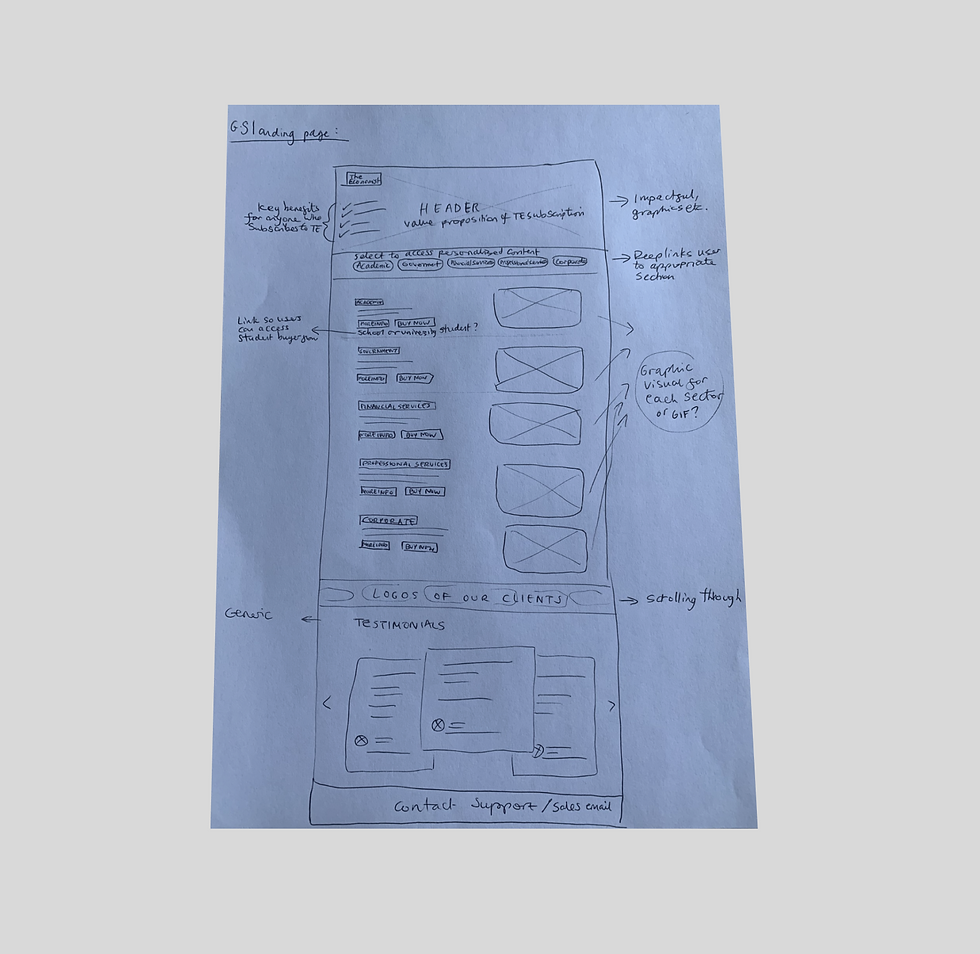
Initial wireframe sketch considering content and layout

Wireframe component modules

Video showing components added into a page layout

Visual exploration
The solution
Through a series of stakeholder playback sessions I refined the user journeys and designs to create a flow which felt professional, informative and helped prospects feel confident in their decision making. Working closely with Marketing, Content, Research and Engineering I developed a new visual direction for the B2B brand. To ensure efficiency and scalability, I leveraged existing design system components while creating new, reusable patterns that now serve as part of our global library. Large-scale icons and contrasting colours have been used to add interest, whilst also utilising graphics and cover images 'The Economist' is so well known for.
By utilising a modular build, we ensured that the primary landing page and the six specialised sub-sector pages could be optimised for different audiences. Key features implemented to drive conversion include:
-
Content teasers: Showcasing snippets of premium content to build trust and demonstrate quality before the prospect engages with Sales
-
Holistic value: Surfacing sector-relevant Podcasts, Newsletters, and Events to showcase the full breadth of The Economist’s B2B offering
-
Targeted benefits: Explicitly calling out industry-specific ROI, making the value of a corporate subscription immediate and unmistakable
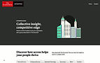
Finalised landing and sub-sector pages
The results
This project transformed a generic landing page into a helpful, multi-sector 'one-stop-shop' that clearly explains the value of The Economist for businesses. By designing the pages with a modular approach, I provided the engineering team with a flexible way to quickly update and reorder content across our six key industries. Launching these new pages alongside the ‘Self-Serve’ model allows smaller teams to subscribe independently, making the process much smoother for them. This shift has simplified the journey for new prospects while allowing our Sales team to focus their time on larger enterprise accounts. Ultimately, we replaced a static page with a more personal, engaging experience built to help the business reach its growth targets.
34%
Increase in "Contact us" submissions
41%
Uplift in calls scheduled via Calendly
25%