PROJECT 01
Small teams, big opportunities

The challenge
At The Economist every B2B prospect was required to engage with a sales rep in order to purchase a group subscription. While this worked for Enterprise-level accounts, it created friction for smaller teams (3–9 users) who simply wanted a fast checkout experience with immediate access to the product.
We needed to introduce a self-serve flow for smaller B2B accounts to purchase through. By doing this, we hoped to:
-
Increase revenue by £200k through our new “mop up” strategy
-
Scale Sales efficiency, allowing Sales reps to focus on larger accounts
-
Improve customer satisfaction by providing efficient purchase flows and seamless onward journeys to our Subscription Management Portal
MY CONTRIBUTION
Product strategy
Workshop facilitation
User research facilitation
User research analysis
Storytelling and presenting
Product design
THE TEAM
1 x Senior Product Designer
1 x Product Manager
VP of B2B
Head of B2B
Head of B2B Sales
Head of Customer Success
6 x Full stack engineers
1 x Senior Researcher
1 x Senior Content Designer
KEY HYPOTHESIS
"By offering a self-serve option for teams of 3-9, we'll increase conversion, CLTV and customer satisfaction whilst reducing the cost of acquisition"
The process
As the sole designer leading the initiative, my role was to spearhead discovery, cross-functional alignment and all product design. This project required me to navigate complex stakeholder relationships, bridging the gap between Finance, Legal, Sales and Customer success teams.
I hosted bi-weekly SteerCo sessions with all stakeholders in order to understand the ask, untangle existing manual processes and ensure alignment. I facilitated workshops to ensure further alignment on next steps and as a way of presenting potential solutions and gathering feedback.
We had technical constraints to consider, and regulatory and legal concerns to take into account. We decided to launch first in the US so as to test the journeys and further iterate before launching to a global audience. This project meant we were building a completely new journey for users, but we wanted to build it into our existing B2B journeys (lead generation pages, marketing and conversion pages etc), further strengthening and building upon what was already developed.
Working under tight timelines, I designed, tested and launched this new journey for B2B prospects, using existing components from our Design System. User research showed us that users wanted a more efficient way to purchase, so we focused our efforts on streamlining cognitive load and reducing friction. By understanding business and user needs, I ensured we didn’t just build a ‘checkout page’. We built a future-proof, scalable product which we could launch in the US, gather data from and then seek to launch globally.
Stakeholder kick off meeting
I started the discovery by facilitating an initial kick off meeting with key stakeholders in order to align thinking and gather key insights from the various business functions. I used Miro to collate all existing knowledge around self-serving, as well as a tool to share B2B journeys and competitor analysis. We wanted to understand the key business needs from this cohort and highlight to them the needs of the user, their jobs to be done as well as share some user research insights and data with them. I conducted research which analysed user journeys across a multitude of similar conversion flows, so we could gauge how these were built across direct and non-direct competitors. I set up a bi-weekly SteerCo so that we could communicate effectively and continue to align on needs throughout the project, through build and to launch.
The kick off was a success, and I was then able to work up various wireframe concepts based off of our discussion to share with the group. I drafted up a high level breakdown of the workshop outcomes, which enabled me to understand key areas to focus on for development of phase 1.

Facilitating our self-serve kick off meeting.
Using Miro to gather information and share knowledge with stakeholders

Gathering key stakeholders and collating business needs from subject matter experts across the business

Breakdown of workshop outcomes, clearly highlighting areas of focus for phase 1 release
Wireframe concepts, prototyping and user testing
Once business and user needs had been established, and we confirmed the metrics we were working towards, I drafted up a series of wireframe concepts I could share with my stakeholders. Version 3 (shown below) was selected following presentation of the concepts and was a starting point for user testing and further design development.
This concept was a simple 2-step process which would help users seamlessly navigate through the journey. It comprised of a sticky summary box (evident on many similar user journeys explored during competitor analysis) which would help users quickly and easily confirm their purchasing details in a simple journey with only essential fields for completion. The journey is further simplified by the removal of an account creation step. The user would instead receive an email with simple next steps to create their account after they've purchased their team subscription, meaning the subscription is paid for with as little friction as possible.
Upon presenting version 3 to stakeholders and engineers (to gauge feasibility and determine average build time) I drafted a higher fidelity wireframe prototype (video attached below) I could test on users. I screened participants to ensure we had relevant test subjects, created a test script and carried out tests using the Usertesting platform. This confirmed:
- Users found the flow clear and were happy with payment options provided
- Users needed more help understanding how to edit their details
- Additional information was needed in regards to the admin portal, and exactly how a user would be able to add their colleagues to the subscription post purchase
Upon completion of the user testing analysis, I began collaborating more closely with our Content Designer, making amendments to the journey based off of feedback received during testing. The test analysis was presented to stakeholders, and their feedback and comments were noted for next steps of the project.

Chosen concept "version 3" showing comments on Miro left by stakeholders following presentation

Higher fidelity wireframe steps for the user

Higher fidelity draft wireframe I created to test the journey with users on Usertesting platform
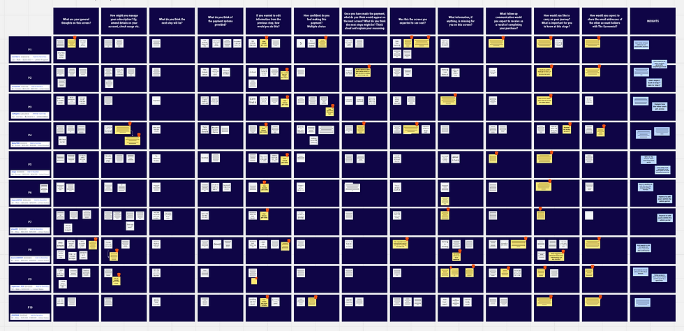
Analysis following prototype tests on relevant users (Those working in B2B with knowledge of The Economist with purchasing powers)
Collaboration—a Know, Feel, Commit session
Working alongside our Content Designer was key to ensuring users had the relevant information they needed at the right time along the journey to purchasing their group subscription. A Know, Feel, Commit session (KFC) was carried out with relevant members of the B2B team, using outcomes from the user tests.
User tests highlighted to us that users expected to add their colleagues to their subscription immediately, therefore this functionality would need to be built into the journey. Communicating this to users was key to them feeling confident in their purchase. Any moment of doubt could lead to the user dropping out of the journey and us missing out on a potential sale.
The KFC session helped us better align on what we wanted users to 'know' during the journey, 'feel' during their interaction with our product, and what actions we wanted them to 'commit' to. Following our session, we grouped our thoughts, prioritised those most relevant and were able to conclude that communicating payment details and next steps regarding how to add colleagues were of most importance. We want users to feel secure and confident during their purchase journey, and to commit to adding their users following payment.

KFC session facilitated on Miro
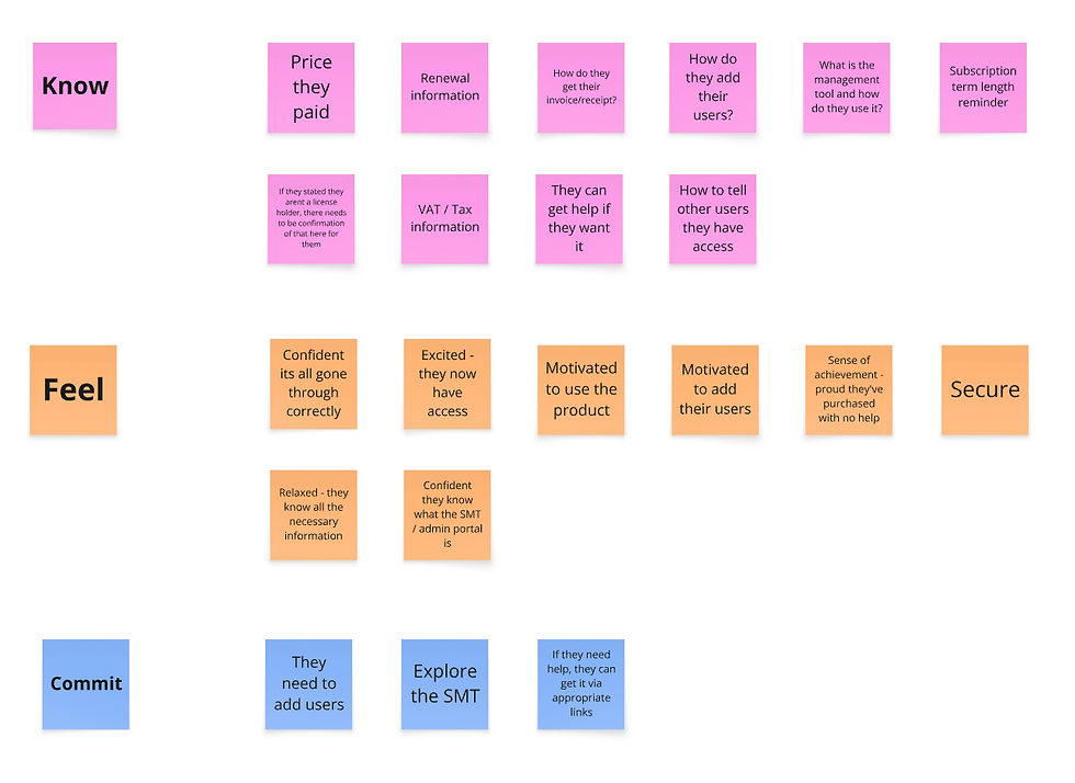
My input into the KFC session
Visual exploration and crit presentation
Using previous discovery work outcomes, competitor analysis and user research findings, I could now begin to work up a potential visual direction for the work. Content, structure and flow were tested and performed well. We wanted to use existing components (where possible) as this could help keep build and QA time to a minimum. This journey needed to feel professional, trustworthy and cohesive. I presented initial work to the design team at a crit, and gathered their insights and opinions before updating designs to reflect these.
High level view of design exploration

Comments from fellow colleagues whilst I presented at crit
The solution
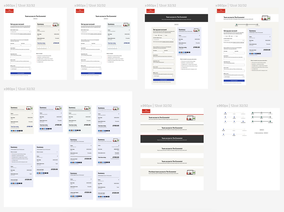
Following crit sessions, meetings with engineers exploring payment providers and presentations with stakeholders sharing my updated and finalised UI designs, the project was at the spec step. I created development-ready design files for engineering and QA to use for the build and subsequent testing phase before launch. My journey focused on giving users psychological momentum, confidence and clarity at every step, maintaining the clean, editorial aesthetic The Economist is well known for. I achieved this by:
-
Reducing cognitive load—A “sticky summary box” highlighted subscription details at a glance and ensured users felt in control and confident throughout
-
Removing friction—Working with engineering, we removed the “Account creation” step prior to purchase, making the flow as efficient as possible
-
Immediate benefits—We empowered new account holders with immediate access to the Subscription Management Tool, allowing admins to become self-sufficient and reducing the burden on our Customer Success teams

UI design across multiple breakpoints
The results
This project established a mature B2B ecosystem by introducing a future-proof self-serve model. By automating the journey for smaller teams, we increased Sales efficiency and provided prospects with immediate purchasing autonomy, driving organic traction without marketing spend.
£200k+
Revenue goal reached within the first 8 months of launch
94%
Admins successfully onboarded teams with no support from Customer Success
15 hours