PROJECT 03
Strategic simplification
The challenge
The legacy "Switch" journey allows users to switch (or cancel) their subscription product mid-term. The existing experience is unnecessarily complex which has resulted in a large surge in churn and a decline in product migrations. It is a critical friction point for subscribers.
By re-engineering the "Switch" journey we hope to:
-
Reduce friction and promote upgrades, driving users to more profitable products
-
Manage downgrades by making these options less prominent
-
Reduce cancellations by building confidence through transparency and value

MY CONTRIBUTION
Product strategy
User research analysis
Storytelling and presenting
Product design
THE TEAM
1 x Senior Product Designer
1 x Product Manager
Head of Value
6 x Full stack engineers
1 x Senior Researcher
KEY HYPOTHESIS
"Removing friction will reduce churn and increase numbers of users switching to another Economist product"
The process
Following a brief initial launch, the existing Switch journey was pulled due to its adverse impact on retention and conversion metrics. As such, this project had a very tight timeline, and I chose to use a more streamlined approach to my process.
Users were overwhelmed by a disproportionate number of decision points, leading to a fragmented experience that changed depending on a user's subscription tier. This also made the build and subsequent maintenance more complex. These journeys proved confusing for the user, and resulted in increased calls to customer support centres which drove up operational costs.
The 5 main use cases to consider were:
- Add print (if a user is a digital user, HMW enable them to add a print edition?)
- Remove print (if a user is on bundle, HMW enable them to remove their print product?)
- Upgrade (if a user is an Espresso user, HMW upgrade them to a Digital or bundle product?)
- Downgrade (if a user is a Digital user, HMW enable them to downgrade to Espresso or Podcasts?)
- Change term (HMW enable a user to change from annual to monthly?
Through a dramatic reduction in journey complexity, I was able to accelerate the design phase and deliver a finalised solution within 2 weeks. I used streamlined processes, relying on existing data and going with my gut.
Exploring existing journeys
The data was clear: churn was up, and upgrades were down. When I dug into the existing journeys, I realised we had 5 separate potential flows a user could go down. This created complicated user flows that were just too much work for users.
I realised the whole experience boiled down to two core questions: "Which product do you want?" and "How do you want to pay?" With that in mind, I stripped away the noise and radically condensed the logic. By focusing only on what mattered, I turned a complex technical hurdle into an intuitive flow that actually helps users make informed decisions.

The 5 existing switch journeys - complex, repetitive and needlessly long

Close up of "Remove print" journey, showing my feedback to discuss with stakeholders

Switch journey entry points from Manage account page. Too many options were proving confusing
Hi-fi wireframes, design exploration and testing
I started by cleaning up the entry point. By replacing a clutter of options with a single, clear "Change your subscription" button, I made sure users weren't overwhelmed upon landing on their account page.
Sticking to my core principle—"What do you want and how will you pay?"—I used our existing design system to build a streamlined product selection screen. I also took the opportunity to remove repetition evident in existing journeys and added clearer product information so users felt confident in what they were switching to.
This didn't just make the journey feel faster; it made the whole flow easier for the engineers to maintain long-term.
When I presented the new logic and cleaner design to stakeholders, the feedback was a unanimous "yes." To back up my gut instinct, I built a quick prototype for a round of usability testing. I analysed the results and all 10 participants found the journey simple and felt confident enough to make a decision quickly. Following on from test analysis I began further visual exploration, and decided to use cleaner UI which would help the user focus more on their decision making during this process.
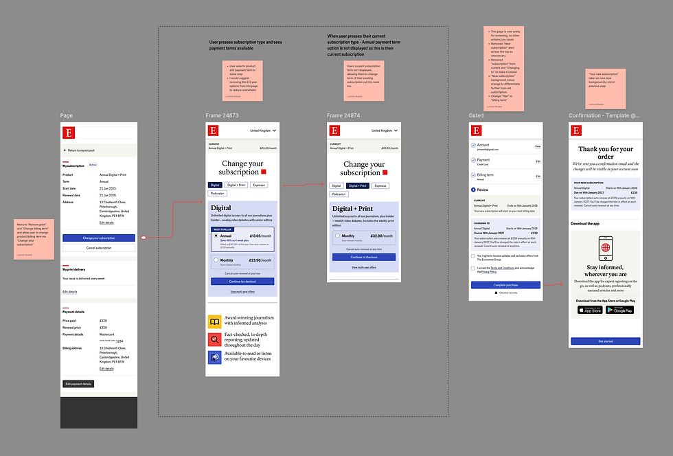
Journey showing shorter, more concise flow to switching product

Close up of optimisations including product selection tab and single button to "Change"

High fidelity desktop wireframe shared with stakeholders for review
Then Vs now
The legacy Switch journey consisted of 5 separate user flows which caused unnecessary confusion, friction as well as increased logic complexity. It resulted in increased user churn (users would rather cancel then go through the complex existing journey), and had to be pulled.
Now, a single point of entry takes users through to a streamlined page (using existing components) which displays available products and payment term information with clear product descriptions so users can make confident, informed decisions on which product they would like to switch to.
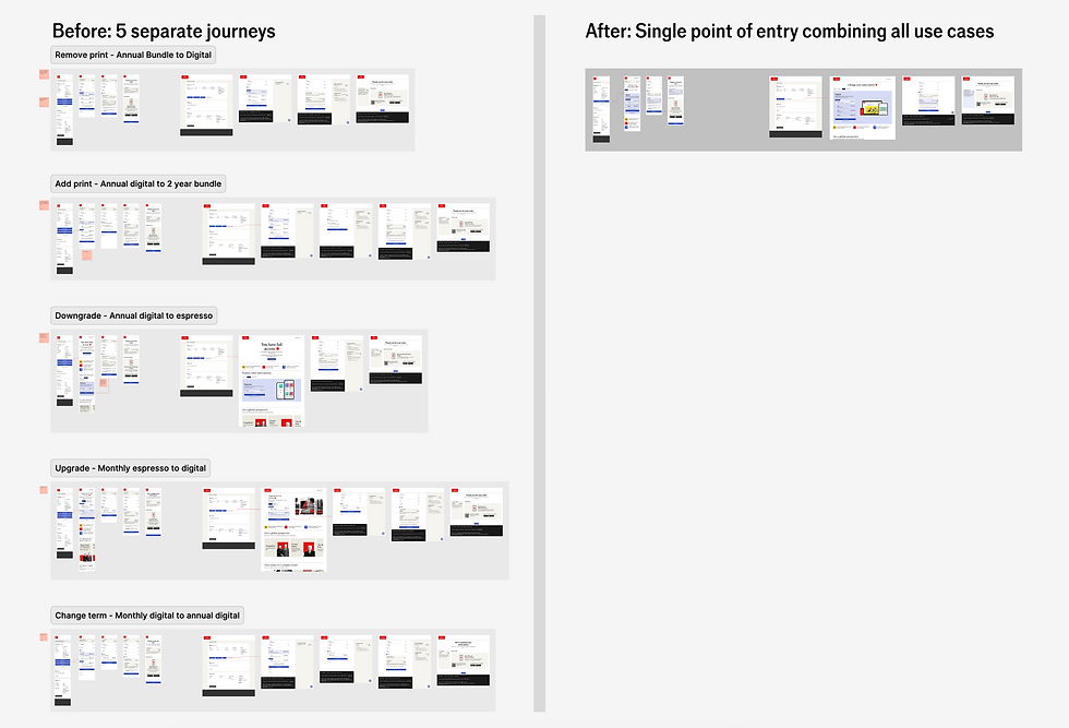
Holistic view showing before and after, and the drastic improvement in journey logic

Final mobile journey showing clean, easy to navigate UI

Exploring potential design solutions for the product selection tab

Demo video created for stakeholder presentation
The results
By using a streamlined design process, and going with my instincts, we successfully relaunched the Switch journey. This resulted in conversion rates and total switch volumes which were significantly higher than pre-launch levels. By creating a unified entry point into the journey, we streamlined the selection process for users. I removed noise and repetition for a frictionless checkout process and improved visual confidence, including high-contrast styling and more explicit language.
65%
Chat volumes originating from the Switch journey are down 65%
50%
Improvement in both conversion rates and volume
30%