
The challenge
The Economist is developing a new customer support strategy aimed at reducing support costs by 30%. Limited discoverability, and an ineffective search experience in the current help centre are driving users towards higher-cost support channels as a way of resolving their issues (it costs The Economist on average over £3000 to cancel a subscription over the phone). The existing help centre has not been optimised for a number of years, and our current FAQs are outdated. Additionally, there is currently no way for users to access "help" via our mobile web experience. By optimising the help centre, we hope to:
-
Streamline and provide a more "conversational" experience for users through an audit of our FAQs and the introduction of AI help summaries
-
Ensure the journeys are as functional for users as possible, adding quick links to popular searches with a modern and intuitive layout
-
Empower users to resolve their queries independently, helping to reduce overall costs. Current support channels (voice, chat and email) are costly to operate, therefore improving self-serve journeys will help us achieve our goals
MY CONTRIBUTION
Product strategy
Workshop facilitation
Card sorting
User research analysis
Storytelling and presenting
Product design
THE TEAM
1 x Senior Product Designer
1 x Product Manager
Head of Sales
Head of Operations Technology
Head of Customer Support
6 x Engineers
1 x Senior Researcher
1 x Senior Content Designer
KEY HYPOTHESIS
"Improving the help centre reduces reliance on customer support, resulting in a decrease in op costs and increase in retention"
The process
I led a deep-dive discovery phase, synthesising user research and data to help me identify friction points within the support journeys. A key finding was our demographic split; with a caller age averaging 80+. There was a clear preference for human interaction to ensure queries were correctly resolved.
In order to shift these users towards self-service, I focused the strategy on three pillars: effortless discovery of the help centre, intuitive navigation once there and high-trust feedback loops. By prioritising the mobile experience and elevating the Help Centre’s visibility, we ensured that the most accessible device became the primary tool for independent problem-solving.
To future-proof the journey and match evolving competitor standards, I advocated for the integration of our newly developed AI summary tool. This transforms the traditional FAQ into a "conversational" interface, providing a more natural, reassuring experience that mimics human support while helping to reduce operational costs.
To ensure the information architecture was grounded, I collaborated with our Content Designer to lead card-sorting exercises and establish a formal Content Strategy Statement. This allowed us to align on content hierarchy, intuitive grouping, and the logical ordering of help topics. Through extensive competitor benchmarking I ensured our final offering wasn't just functional, but market-leading in its efficiency and ease of use.
Data, research and competitor analysis
Quantitative data served as the foundation for our content audit, allowing us to identify popular FAQs and deprecate obsolete articles which no longer served users. To bridge the gap between "what" users were doing and "why" they were doing it, I created and deployed an unmoderated survey (sent out to 80k subscribers) targeting users who had interacted with help and support within the last year. By leveraging AI to analyse these qualitative insights, I was able to rapidly identify key behavioural drivers. There was a high demand for personalised assistance, immediate resolution confirmation, and anxieties surrounding security and delivery logistics. Data showed me that the most popular contact queries for users of the help centre were subscription cancellation, issues with delivery, invoicing concerns and password resetting.
Research revealed that many users opted to speak to a customer services assistant due to a desire for additional reassurance. I presented these findings to senior stakeholders to drive cross-functional alignment on our roadmap, highlighting that our challenge was as much about psychological reassurance as it was about creating UI which helped users feel confident.
I conducted an extensive competitive benchmarking exercise across a diverse landscape of digital products. This allowed me to map emerging navigation patterns and evaluate the current state of AI integration in self-service journeys. By analysing both direct and non-direct competitors, I ensured our proposed layout and AI-driven conversational tools were grounded in industry best practices.

Overview of my competitor analysis exploring a variety of products from banking to utilities. I presented findings to stakeholders for their alignment and buy in

Analysing existing journeys across mobile and web

Thousands of search queries summarised using AI
Sketching and wireframing
Taking insights gained from the discovery phase I moved into the ideation phase of the project. To help ensure early buy-in, I facilitated a Miro 'co-design' sketching session with stakeholders. This approach allowed us to untangle complex journey requirements in real-time, transforming the design process into an open dialogue that aligned diverse perspectives on the product's vision.
Through a series of "How Might We's" we established a framework for the new Help Centre. This shifted our focus towards a "proactive support" model, characterised by the following strategic enhancements for users interacting with the journey:
-
Elevated discoverability: Surfacing help entry points significantly earlier in the user lifecycle to intercept friction before it escalates to a support call (i.e. giving users ability to gain access to the Help Centre via the mobile web experience).
-
Information architecture (IA) Overhaul: Implementing a rigorous content audit to deprecate irrelevant FAQs, replaced by intuitively categorised and clearly labeled help topics which are easier to follow.
-
Efficiency features: Introducing high-visibility "Quick Links" for top-tier queries and dynamic breadcrumbs to streamline navigation.
-
Trust and transparency: Utilising "Social Proof" to validate the effectiveness of self-service and integrating dynamic system alerts to provide real-time updates on print and delivery issues.
-
Frictionless resolution: Surfacing ability to cancel, reducing user anxiety and building long-term brand trust.

Close up view of some of my hand drawn initial sketches
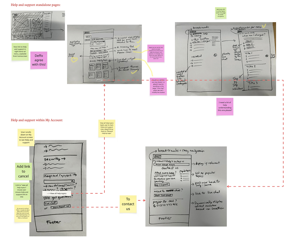
Interactive session held with stakeholders, their feedback shared as post its
Strategic framework and content vision
To ensure the Help Centre’s content was both effective and intuitive to navigate, I helped to facilitate a Content Strategy Statement session. I brought together a cross-functional group of Senior Content Designers and Customer Service Subject Matter Experts. This exercise served as our "strategic barometer," ensuring that every subsequent design decision was measured against this for a unified vision for success.
During this workshop, we mapped out a comprehensive profile of our audience and their primary pain points, balancing user needs against our core business objectives. By theming post its we drafted a mission statement to guide the product’s vision and evolution:
"We'll build a help centre that makes customers feel confident and supported: a place where answers to questions are clear, reliable and easy to find, reducing the need for direct support and increasing self-serve."
Following this session, the content designer began an audit of our existing collection of 225 FAQs. A card sorting session was then planned which would help us form the information hierarchy for the help centre. We could then test these with users to determine how successful the card sorting had been, and how intuitive the groupings were. This would then form the basis of the new help categories. Once we had clarity on that, the audited FAQs needed to be rewritten, with a focus on ensuring a consistent tone of voice and concise answers. AI was used here to help make the process more efficient. The AI summary tool recently developed by the engineers would also be added into this experience to not only keep us competitive among similar products, but to ensure our users had access to the most efficient help sources.

Wireframe showing new direct journey into the Help centre via mobile web

Wireframe selected to move forward into next phase; clean layout allows user to focus on the AI summary search bar as well as the clearly defined help categories below

Overview of the content strategy groupings

Initial card sorting using a selection of remaining FAQs following audit
Visual exploration through to spec files
Following the initial design phase, I moved onto design generation. Results from tree-jack testing confirmed that our revamped help categories were intuitive, while usability testing on my wireframes demonstrated that users could seamlessly locate the Help Centre across both mobile and desktop. By achieving these KPIs for visibility and discoverability, I was able to transition from wireframes to high-fidelity designs with confidence.
The final interface was refined through design critiques and stakeholder presentations, resulting in a minimalist, modern aesthetic that centred the user experience on the search functionality and core help categories. To specifically address the "Cost to Serve" goal, I intentionally prioritised a more visible Live Chat entry point. This strategy directs users towards a more cost-effective channel, allowing support agents to handle concurrent inquiries, therefore improving operational efficiency.
To ensure the product remained inclusive for our primary demographic, I utilised high-contrast, large-scale iconography to facilitate easier navigation for users with accessibility needs. On mobile, the UI was further optimised for speed and vertical screen space. The result is a streamlined, future-proof support workflow that empowers users to self-serve while maintaining the "conversational" reassurance established in our content strategy. Additionally, social proof was included on the page to give users further confidence.

Manually sorting cards gave us a better overview. We tested these groupings with users before confirming the categories

High level view of desktop design exploration

Hoverstate exploration with prototypes where appropriate
The solution
The final result is a future-proof Help centre with increased discoverability, sophisticated AI integration and human-centric UI. By transforming the Help centre from a static repository with outdated FAQ articles into a guidance tool, I successfully bridged the gap between operational efficiency and the needs of subscribers.
Upon entry, the user is presented with an AI-powered conversational search bar for direct inquiries, quick links to popular FAQs and a suite of structured help categories for more guided discovery. Help articles are delivered in digestible, informative segments, supported by contextual cross-links to ensure a comprehensive and self-contained Help centre experience.

Mobile optimisation exploration

UI across mobile experience
Projected results
This project was a deeply collaborative cross-functional effort. Metrics shown here reflect the expected results from project completion. Our goal was to reduce cost-to-serve, streamlining and optimising journeys improving discoverability of the support ecosystem, ensuring users could seamlessly navigate and find reliable answers to their queries independently.
30%
Overall reduction in cost-to-serve through improved channels
90%
Success rate achieved during high fidelity usability testing of new journeys
25%